Day 16: Urban/Rural - Agricultural and Urban Lands of the United States
Mapping Agricultural and Urban Lands of the United States
For today’s map challenge, my theme is urban/rural. I decided to keep today’s mapping exercise simple by limiting what I wanted to show. I settled on making two maps, one showing all agricultural lands in the United States and another showing all urbanized areas, by level of intensity.
Approach:
To start, I created two map projects in ArcGIS Pro, one to show agricultural lands and another to show urban areas. For my data, I relied on the United States Geological Survey’s (USGS) National Landcover Database (NLCD), a phenomenal raster dataset showing landcover classifications for the entirety of the United States (in a recent post I used this dataset to map tree canopy cover and forest type in the United States). From ArcGIS Pro, I imported the USGS NLCD layer directly into both mapping projects using Esri’s Living Atlas. The USGS data is also available for download, here. One I had my data for each project, I went into the symbology tab and filtered out the corresponding landcover data types I wanted to show.
For my agricultural lands map, I selected the “cultivated crops”, which the USGS uses to denote farmlands, and “pastures/hay” layers, which includes land used for livestock grazing or the production of seed or hay crops. I then removed the remaining USGS layers to avoid cluttering my map. This resulted in a map that only showed agricultural lands for the entire country. For my urbanized area’s map, I followed a similar process. I started by selecting the following layers: “developed high intensity”, “developed medium intensity”, “developed low intensity”, and “developed open space”. These four layers represent a scale of urban intensity, with the high intensity category indicating densely urbanized areas, where structures like apartment complexes and rowhomes predominate, while open space areas correspond with a lower level of density and single-family homes are more common.
After I had both maps set with their requires data layers, I played around with color symbols of both maps until I landed on something that I thought looked good. Below are my resulting maps.
Agricultural Landcover Map:
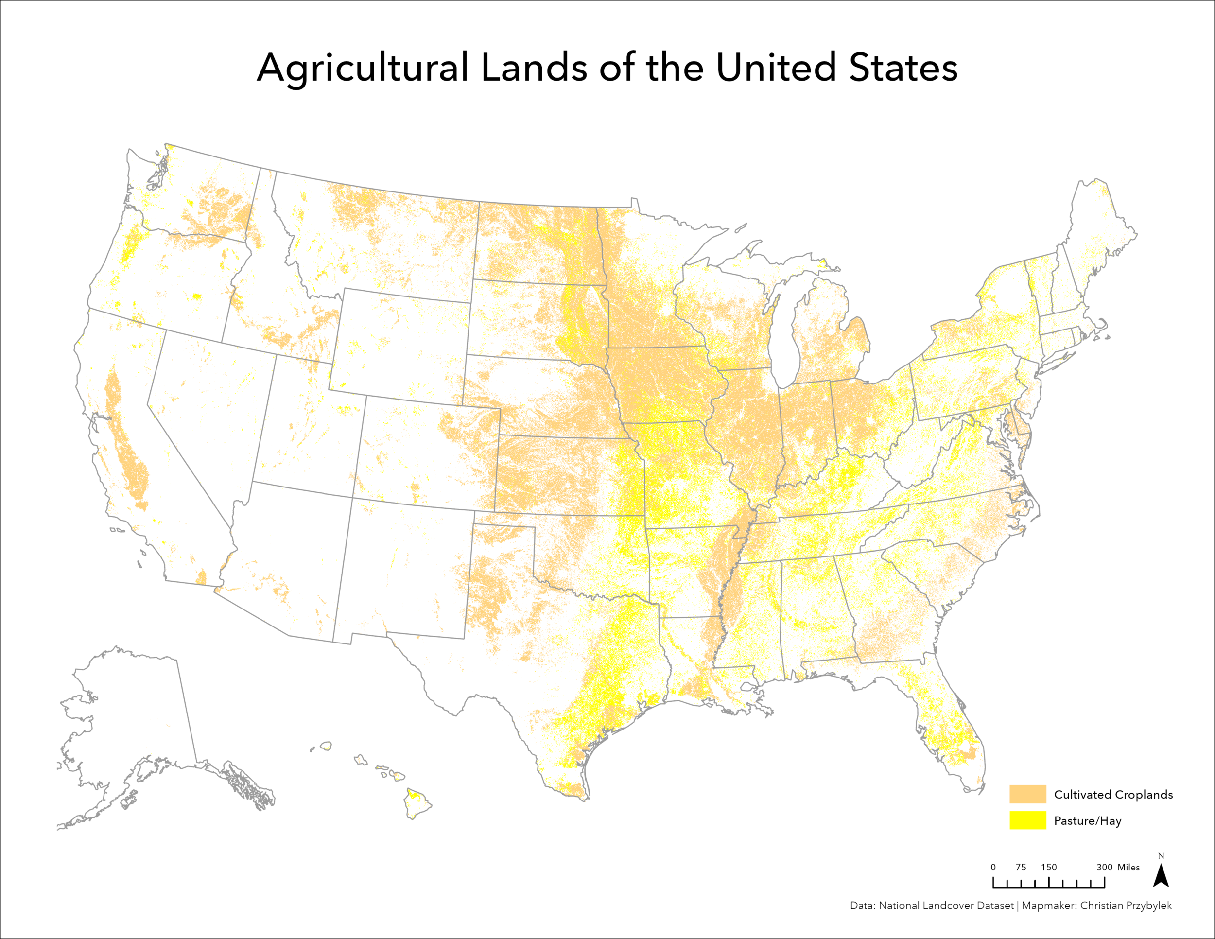
In reviewing the data on this map, one can clearly see areas of agricultural intensity, including: the Atlantic Coastal Plane and Chesapeake Bay region, the Mississippi River corridor, the mid-western states that comprise the Corn Belt, West Texas, California’s Central Valley, and parts of western Washington, Idaho and Montana. You can also make out areas with a lot of pasture/hay lands, including in the Piedmont region in the Southeastern and Mid-Atlantic US, eastern Texas, and Hawaii.
Urban Areas of the United States Map:

This second map shows the distribution of major population centers across the United States. If you know where to look, you can clearly delineate the urban footprints of major and medium sized American population centers. Moving from east to west, the cities that comprise the Northeast Megalopolis (including DC, Philly, NYC, and Boston) are prominent. Moving south, you can also clearly Atlanta and Miami. Moving west, you can make out Houston and Dallas. Going north again, you can see Detroit, Chicago, and Minneapolis. In the Desert Southwest, you can see Santa Fe and Phoenix. Moving to the Pacific Coast, you can see San Diego, Los Angeles, the San Francisco Bay Area, Portland, and Seattle. Many more places are visible on this map. It is certainly interesting to look at. One thing that strikes me is how inter-connected and interdependent each of the core urban areas appear to be with one another.