30 Day Map Challenge Day 2: Lines - Joy Plot of Pennsylvania
JOY PLOT OF PENNSYLVANIA
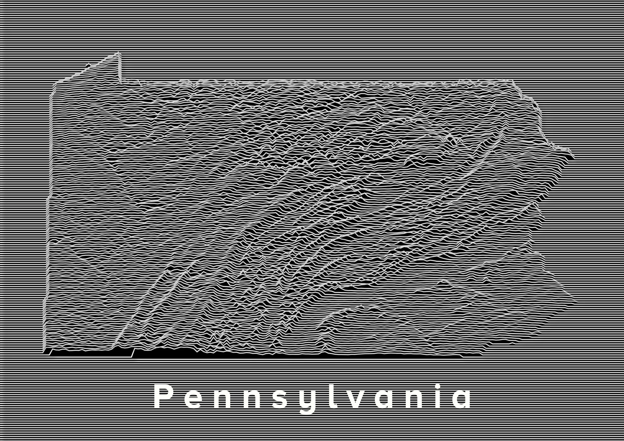
For day 2 of the #30DayMappingChallenge my theme is lines. The theme’s broadness makes choosing a subject difficult. There are a considerable number of worthy line datasets and subjects (rail lines, shipping routes, trails…etc) that could have worked for this, , but I decided to repeat a classic, and landed on making a Topographic Joy Plot map of Pennsylvania. This style of map uses lines to depict elevation change/topography and statistical data, like population density. This technique produces a modern looking minimalist style map, though this cartographic technique isn’t exactly new. It was re-popularized by the punk band, Joy Division by their release of their 1979 Unknown Pleasures album (it’s a killer album).
Approach
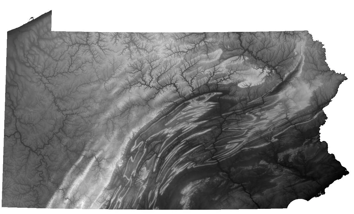
I wanted to make this map using only open-source tools and data. I turned to QGIS, an open-source Geographic Information System (GIS) platform, and Digital Elevation Model (DEM) data from NASA’s Shuttle Radar Topography Mission (STRM), which provides 30-meter resolution DEMs of most of the world, for free. If you’re unfamiliar with the term, a DEM is simply a representation of the topography of Earth's surface, excluding objects such as trees and buildings. It is a image file that a GIS system can convert to topographic representations like hillshades, or in this case, Joy Plots.
To start, I downloaded STRM DEM data for Pennsylvania, stitching DEMs together, and clipped them to Pennsylvania’s boundaries in QGIS (recently, I came across an amazing website that makes downloading STRM DEM data incredibly easy). From there, I followed a workflow outlined in a blog post over on the Hannes.Enjoys.IT blog, which relies on QGIS’s Geometry Generator and a python script.
Becerra Hennessy also provides a great video tutorial on how to use QGIS to make a Joy Ploy over on his YouTube channel. The video is in Spanish, but even if you’re not a Spanish speaker his workflow is straightforward and easy to follow along with.
Pennsylvania DEM
After I had my Pennsylvania DEM set up in QGIS, I followed the steps outlined in the Hannes.Enjoys.IT blog post, adjusting the python code and symbology settings in QGIS until I settled on a final design. Below is my final version of the Joy Plot.
Pennsylvania Joy Plot

