30 Day Map Challenge Day 1: Points - Mapping UFO Reports in the Continental US

Mapping UFO Reports in the Continental United States
Data Source: National UFO Reporting Center (NUFORC)
For my first map during this year’s #30DayMapChallenge, I needed to design something with points. After some exploration, I settled on an open-source data set of Unidentified Flying Object (UFO)/Unexplained Aerial Phenomena (UAP) reports managed by the National UFO Reporting Network (NUFORC), an organization that receives and catalogs UFO/UAP reports. While the subject matter may seem a little obscure, other cartographers have made some amazingly detailed and beautiful maps using this and similar data sets, including this amazing choropleth UFO sightings per capita map by the great John Nelson.
In recent years, the subject of UFOs/UAPs has also become more mainstream and less niche, with reputable news outlets like the New York Times reporting on the Pentagon’s secretive Advanced Aerospace Threat Identification Program (ATIP) that was stood up to investigate unexplained sightings by military personnel and a more recent Preliminary Threat Assessment Report to Congress from the Office of the Director of National Intelligence (DNI) exploring the UFO/UAP phenomena’s potential threat to the United States. While the DNI’s report to Congress does not conclude what the majority of these unexplained sightings are, it does offer four “buckets” to categorize sightings, including: natural atmospheric phenomena, US government or industry development programs (A.K.A. secret US aircraft), foreign adversary systems (secret foreign aircraft or craft belonging to non-state actors), and other. The report’s peculiar inclusion of the “other” category is curious. While neither myself nor the US government may be able to fully explain the things people are reportedly seeing in our skies, I can plot UFO/UAP reports on a map and have some fun along the way. Let’s see what we get.
Reviewing and Interrogating the Data
Now that I have confirmed UFO/UAP sightings as my subject and identified my data source for point data, it is important to critically examine the data set. I downloaded data from NUFORC via ArcGIS Online, where someone had shared a geocoded version of it (a slightly older version of the NUFORC dataset can be downloaded here as a .csv file). Below is a snippet of the resulting attribute table, outlining NUFORC’s data model.
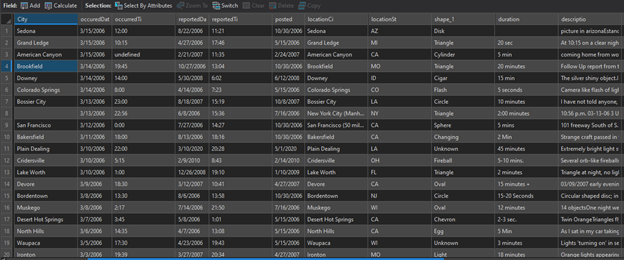
NUFORC UFO Data Attribute Table
In reviewing the UFO file’s attribute table, we see that reports captures the following key elements:
Date & time the sighting occurred
Date and time the sighting was reported (to NUFORC)
Shape of the object reported
During of the sighting
Description field
Now that we know what information is being collected, let’s plot these reports as points of light on a global map. Below is an image of the full data set, mapped to the world.
In looking at the collection of UFO/UAP sightings plotted on a map of the world (see above) something curious about the distribution of the sightings reported caught my eye. Sightings appear to be more heavily clustered in the United States, the United Kingdom and, to a lesser extent, other predominantly English-speaking countries. Why is that?
Could it be tied to something about the cultures of the countries where reports are higher, perhaps due to the influence of a panoply of UFO-related science fiction movies and books? Could it have something to do with the locations of these places? These are fair questions, but I don’t think the answer lies wholly with culture or geography but something more mundane. I posit that the pattern we are observing is likely due to limitations in data collection methods (how a UFO/UAP sighting gets reported), and a global lack of access to reliable internet or data connections.
By visiting NUFORC’s website, we can explore the instruments they have for collecting reports that populate this data set. The organization has set up a web form for filing reports (http://www.ufocenter.com/reportform.html) and a hotline to phone in your sighting(s). In reviewing the form, and checking the number, I found that they currently do not translate their reporting form into other languages, nor do they appear to offer telephonic interpretation for their reporting hotline. Additionally, for those outside of the US, calling a US-based hotline may be difficult to do or expensive. It is also unclear how much marketing this organization does, but one can reasonably assume that they do not receive many of the potential reports out there simply by the fact that most people don’t know about the organization and therefore will not report their sightings to it. An additional barrier is that, just as in many parts of the US, there are many locations in the world that do not have reliable, consistent internet or mobile data access. If someone knew where to report a sighting, but couldn’t log on to report it, it would go unreported.
It would appear to be far more likely that the map shows geographic clusters due in large part to data collection methods related to language access barriers, gaps in internet and phone access and a lack of public awareness that the reporting system exists, especially outside of the United States. An additional limitation with the data is that it is appears to be entirely self-reported, and it would be easy to submit a phony report as a hoax. We have to assume that this data set contains at least some fake reports.
That being noted, all data has limitations. It is always important for a geographer to acknowledge this and to interrogate their data, whether working with UFO/UAP reports, wildfire patterns, or incidence of illness in a population. Always explore your data and ascertain whether it is accurate, current, and authoritative. While this particular data set has some drawbacks, it still provides rich data and is interesting to map (and its free!).
Methods & Resulting Maps!
Now that I have settled on UFO/UAP sightings as the subject of my map and have an understanding of the data, I want to fine tune my approach and tighten up some my project’s parameters. I am curious about UFO/UAP sightings in Continental United States and decide to limit my map’s project area to only include sightings that were reported in the Lower 48. I filtered the data set to only include reports from the Continental United States and the results included sightings from 1905 through 2020. With these parameters set, after examining the data again, I decided I wanted to make two maps: one that displayed all UFO/UAP sightings reported in the Lower 48; another that showed UFO/UAP sightings by shape.
Map 1: All UFO/UAP Sightings in the Lower 48 United States
For my first, I thought it would be nifty to map all UFO/UAP sightings in the Continental US using a firefly glow style, visualizing sightings as green pinpricks of light against a dark basemap. This will highlight the point data and hopefully draw a reader’s eye to where sightings are being reported, while at the same time toning down everything else. After reviewing the initial global map above, I expected most sightings would correspond to more populated areas, and less populated areas would generate fewer reports. Below are my results.

In looking at the resulting map, we can make out the outlines of major cities and if you know what your looking for you can probably identify places like New York, Philadelphia, Baltimore/DC, Dallas/Ft Worth, Chicago, Salt Lake City, Los Angeles, Miami …etc. This could be mistaken for an urbanized area map. We cannot determine much from this map other than the phenomena is seen by people near where they live, work or travel. While I do not find these results particularly useful for analysis, they do make for an interesting map. The pattern also reminds us that whatever UFOs/UAP are, there is a human component to the phenomena that’s just as interesting as the phenomena itself.
Map 2: UFO/UAP Sightings by Most Common Shape
After making the above map, I remembered that the NUFORC data set also contained UFO/UAP shapes and decided to map the top ten most reported UFO/UAP shapes. To determine what shapes people are reporting the most, I ran the numbers and created a bar graph in ArcGIS Pro showing the 10 most commonly reported shapes. These are provided in the bar graph below.

We see shapes described simply as light are by far the most common, with 11,902 sightings reported. This is followed by circle, with 6,392 reports; triangles, with 5,097 reports; unknown*, with 3,891 reports; spheres, with 3,766 reports; other*, with 3,662 reports; disk, with 2,493 reports; ovals, with 2,425 reports, and undefined*, with 2,109 reports. Note: the unknown, other, and undefined categories seemed odd to have as separate categories, given that the distinction between the three very similar seeming categories is unclear, but I decided to keep them separate rather than recoding and grouping them together. In a future project, it may make sense to group these three categories of reports together as the distinction between them appears to be ambiguous.
Once I had the top ten most commonly reported UFO/UAP shapes identified, I filtered out the rest of the results to remove them from my final map. For my map style, I decided to stick with the firefly theme, but I assigned each shape its own color. The results are kind of neat and colorful.

In reviewing the results, this map reminds me of the first in that sightings largely correspond to where people live, which intuitively makes sense. This should not be surprising because it is the same data set. Another thing I notice is that the sightings by shape appears to reflect a random distribution. What do you think? Feel free to add your thoughts in the comments below. In any case, its kind of a cool map.
Overall, I really enjoyed working with this data set and appreciate NUFORC for building, maintaining and sharing it for free. Keep looking up!